In Defense of the Pie Chart: Why We Should Rethink Its Reputation
Is the pie chart inherently flawed, or just the victim of systemic misuse? Read why we're defending it and how AI fixes data visualization.
Co-Founder & CEO
If you were to walk into a room of data analysts and declare your appreciation for pie charts, you might raise a few eyebrows.
In the data visualization community, the pie chart is often a highly debated topic. It is frequently discouraged in style guides, bypassed in favor of other formats, and routinely critiqued by data viz purists. The general consensus is usually quite clear: just use a bar chart instead.
But is the pie chart inherently flawed? Or has it simply been the victim of decades of systemic misuse?
At Exmergo, we spend our days building AI agents that automate complex data analytics. We’ve analyzed countless dashboards and visualization habits, and we’ve come to a somewhat contrarian conclusion: It might be time to defend the pie chart.
Here is a look at why the skepticism goes a bit too far, when you should actually use them, and how AI is fixing the visualization problem for good.
Why the Hesitation Exists (And Is Mostly Justified)
Let’s validate the analysts’ perspective first. The hesitation around pie charts doesn’t come from nowhere; it comes from years of opening executive presentations and encountering confusing graphics like these:
- The 3D Exploding Pie: Adding a 3D effect distorts the area, making slices in the “front” look massive even if the underlying data value is actually quite small.
- The 50-Slice Overload: A pie chart showing the market share of 50 different micro-competitors results in razor-thin slivers of indistinguishable colors that are nearly impossible to read.
- The “Doesn’t Add to 100%” Pie: A common pitfall in data visualization, usually the result of multiple-choice survey questions mistakenly mapped onto a circle.
The core scientific argument against pie charts is that the human brain is simply not very good at accurately comparing angles and 2D areas. We are much better at comparing lengths on a uniform baseline, which is exactly why bar charts have become the default.
However, just because a tool is easily misused doesn’t mean it lacks a valuable purpose.
The Defense: What the Pie Chart Does Best
The pie chart has one specific strength that a standard bar chart fundamentally lacks: it instantly communicates a part-to-whole relationship. When you look at a bar chart, your brain has to do a little bit of math to understand what percentage a single bar represents out of the total. A pie chart, on the other hand, visually represents “the whole” as a complete circle. You don’t need a perfectly labeled axis to know when a slice is exactly half, a quarter, or a dominant majority of the whole picture.
A pie chart is actually an excellent choice when you meet these three specific conditions:
- You have a very small number of categories (ideally 2 to 4 maximum).
- You are trying to show a stark contrast or a dominant majority.
- The exact micro-differences between the numbers are less important than the big picture.
The “Overwhelming Majority” Use Case
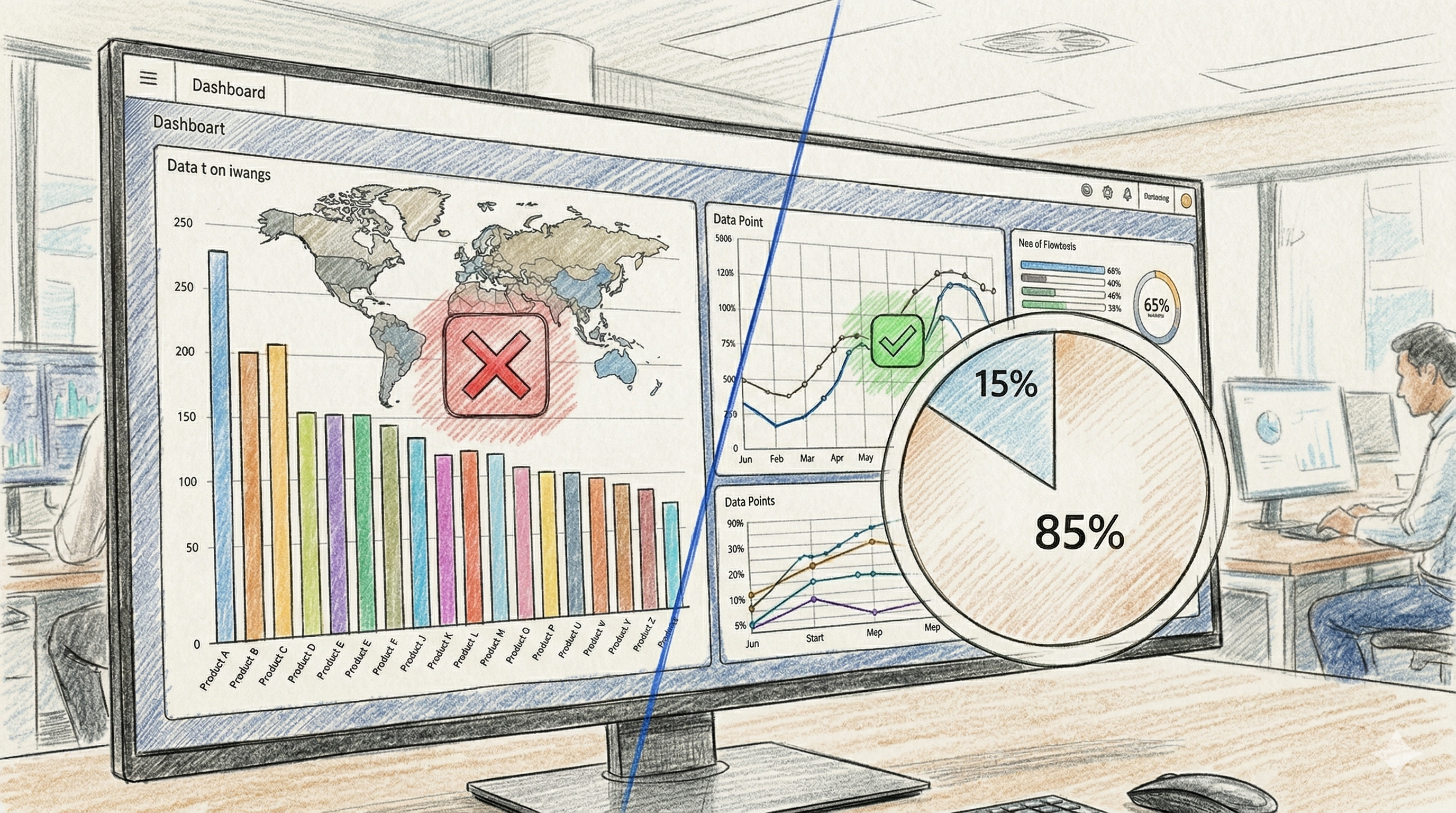
Imagine you want to show that 85% of your revenue comes from just one flagship product, while three other products make up the remaining 15%.
A bar chart shows these numbers accurately, but a pie chart creates a visceral, immediate understanding. A massive slice dominating the circle instantly tells the viewer: “This one product is carrying the business.” Great data visualization isn’t just about plotting numbers accurately; it’s about reducing the cognitive load required to understand the story behind the data. In the right context, a pie chart accomplishes this beautifully.
Stop Blaming the Chart. Look to the Process.
Ultimately, the real issue isn’t the pie chart itself. The challenge is that traditional Business Intelligence (BI) tools are entirely passive. They allow users to highlight 15 rows of highly nuanced data and blindly click the “Pie Chart” icon without any contextual guidance.
To solve bad data visualization, we don’t need to ban specific charts. We need intuitive systems that understand the context of the data and the intent of the user.
Enter Exmergo Viz: The Dashboard AI Agent
At Exmergo, we believe you shouldn’t have to be an expert in data visualization theory to generate a helpful, accurate dashboard.
That is why we built Exmergo Viz, the Dashboard AI Agent.
Viz doesn’t just passively map your data to whatever chart type you happen to click. Instead, it acts as a collaborative expert data analyst. When you ask Exmergo Viz a question about your data, the AI agent evaluates the cardinality, the variance, and the underlying relationship of the metrics.
- If you have 15 categories to compare, Viz automatically builds a beautifully sorted horizontal bar chart.
- If you want to track a metric over time, it generates a clean, readable line graph.
- And if you need to show that a single demographic makes up 80% of your user base? Exmergo Viz will proudly, and correctly, give you a pie chart.
Stop wrestling with passive BI tools and let AI design the perfect dashboard for your needs.
Ready to see what intelligent, friendly data analytics looks like? Discover Exmergo Viz today.
Resources
https://www.exmergo.com/why-exmergo-viz
https://www.exmergo.com/enterprise