
Exploring a Formula 1 data warehouse with Dex and Viz
Antonio Pascarella
In 1989, almost 7 out of 10 Formula 1 cars did not finish the race. In 2024, that number dropped to fewer than 1 in 10.
This repo shows how to take a raw, undocumented database and turn it into clean data models and clear charts, using two tools from Exmergo: Dex for the data work and Viz for the visuals. The data is 75 years of Formula 1 history, so the result is also a set of stories any F1 fan will enjoy.
If you are here for the tools, this is a start-to-finish walkthrough you can copy on your own data. If you are here for the racing, skip to The findings and enjoy the charts.
What is Dex, and why it is useful
Dex is an analytics engineering toolkit built for AI coding agents (Claude Code, Cursor, Codex). You point an agent at your warehouse, and Dex gives it a safe path through the whole job: explore the data, model it with dbt, and keep it maintained.
Two things make it usable in practice:
- A cost guard. Every query is estimated before it runs, so an agent cannot quietly spend your warehouse budget.
- A PII firewall. Columns that look like personal data (names, birth dates, locations) are flagged and blocked. The agent can count them but never read the values.
The short version: Dex lets an agent do real data work without reading raw private data or running up a bill.
What is Viz, and why it is useful
Viz is a dashboard agent. You give it a clean table and ask for a chart in plain English. It writes the chart for you, so there is no SQL to hand-tune and no chart config to fiddle with. It works best on tidy, ready-to-plot tables, which is exactly what the Dex step produces.
Together the two cover the full path: Dex gets the data into shape, Viz turns it into something people can read.
The data
The source is the public Ergast Formula 1 archive, loaded into a single local DuckDB file. It covers 75 seasons, from 1950 to 2024, and holds 45 objects in total. No documentation came with it.
The core tables are the ones an analyst would reach for first:
| Table | Rows | What it holds |
|---|---|---|
races | 1,125 | Every Grand Prix, with year, round, and circuit |
results | 26,599 | One row per car per race: grid, finish position, points, status |
lap_times | 580,619 | Every recorded lap |
pit_stops | 11,120 | Every recorded stop, with duration |
qualifying | 10,334 | Qualifying times per driver per race |
drivers | 860 | Driver reference data |
constructors | 212 | Team reference data |
status | 139 | Finish and retirement reasons (Finished, Engine, Accident, and so on) |
seasons | 75 | One row per year |
The rest are pre-aggregated season summaries (wins by season, podiums by season, and similar). Two facts about coverage matter for everything below, and both were found by the tool, not told to it:
- Pit stop data only starts in 2011. Any pit stop trend before that year would be built on nothing.
- 2024 is a partial season here (16 of 24 races). Every chart treats it as partial.
The steps
Step 1: Dex explores
The first move was dex explore. It connects to the database read-only, ranks the tables by how central they are, profiles the important ones, and works out how they join. No rows enter the agent's context while it does this.
What came back was a map of a database the agent had never seen:
- The ranking put
races,results,drivers, andlap_timesat the top, which is where a human analyst would start too. - Profiling surfaced things nobody had written down: pit stops only exist from 2011, 41% of result rows have a null finishing position (those are the cars that did not finish), and the longest recorded "pit stop" is 51 minutes (a red flag stoppage sitting in the same column as routine stops).
- PII got flagged automatically: 37 columns (driver names, birth dates, circuit locations). The firewall blocked value-level reads on all of them.
- The join graph came back as 75 relationships, each one checked against the real data for orphaned keys. All 75 passed.
The value of this step is not the SQL. It is that the data quality traps (partial coverage, polluted columns, misleading nulls) were on the table before any analysis was built on top of them.
Step 2: Dex transforms
Next was dex transform. The agent scaffolded a dbt project (f1_blog/), wrote staging models over the raw tables, and then built three marts, one per story. Every change arrived as a diff to review before it was written, and the build ran against a dev copy of the database, never the source.
The result: 8 models, 44 data tests, all green, in under a minute on a laptop.
The three marts are deliberately small. One row per season, ready to plot:
| Mart | Grain | Key columns |
|---|---|---|
mart_season_reliability | year | entries, DNFs, mechanical failures |
mart_pit_stop_trends | year | mean, median, and outlier-cleaned pit times |
mart_constructor_dominance | year | strongest team of the season, by win share and points share |
Each mart is exported to CSV in exports/. Those CSVs are the handoff to the next tool.
Step 3: The shift from Dex to Viz
The handoff is simple, and this is the part worth copying. Dex leaves you with clean, one-row-per-season tables. Viz wants exactly that. So the move from data work to charts is just:
- Take the three CSVs from
exports/. - Upload them to Viz.
- Ask for each chart in plain English.
No re-modelling, no reshaping, no glue code. Because the marts already have the right grain and clean columns, the prompts stay short. The exact prompts used are saved in exports/viz_prompts.md so you can reproduce every chart word for word. Each chart below is a direct screenshot of what Viz produced.
Getting the chart right takes a few tries
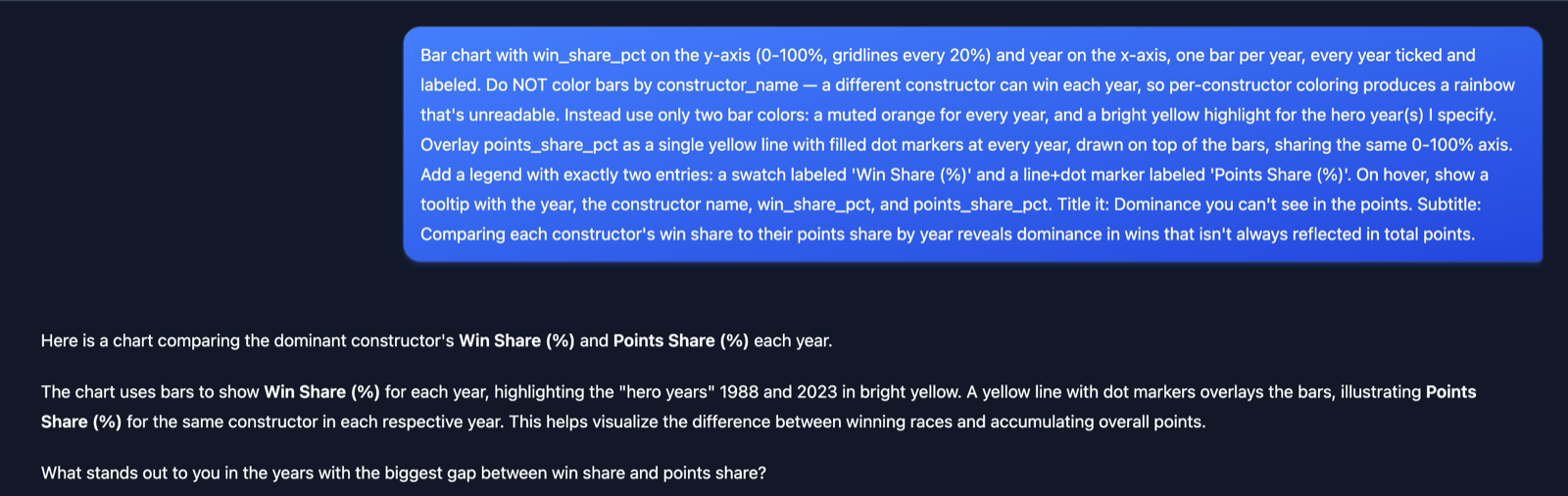
Being honest about the workflow matters. Viz is fast, but the first prompt rarely lands the final chart. The full-history version of the dominance view (a companion to the three era panels below) took four short rounds. Here is the actual conversation.
Round 1: the opening brief. One long prompt set up the whole chart in a single shot: win share as bars, points share as an overlaid line, two flat bar colors, and a highlight for the hero seasons.
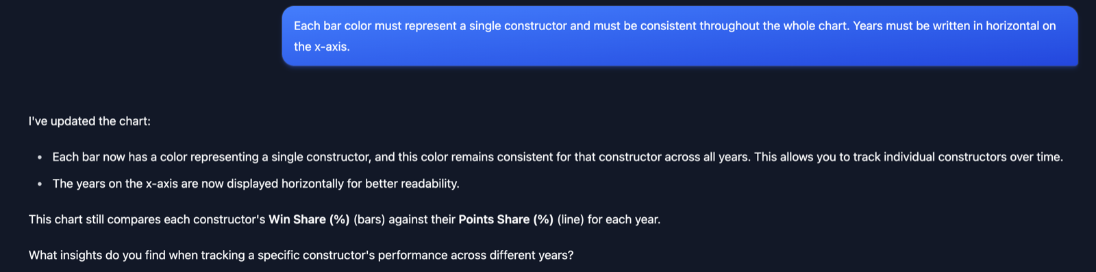
Round 2: a reversal. The first prompt said not to color by constructor. Once we saw the result, we changed our minds. One steady color per team makes a constructor easy to follow across the decades, so we asked for exactly that, plus horizontal year labels.
Rounds 3 and 4: the finishing touches. The points share line needed to stand apart from the bars, so we sent it green. Then, because the green dots vanished on the green bars, we deepened the line to forest green and gave each dot a thin white ring.
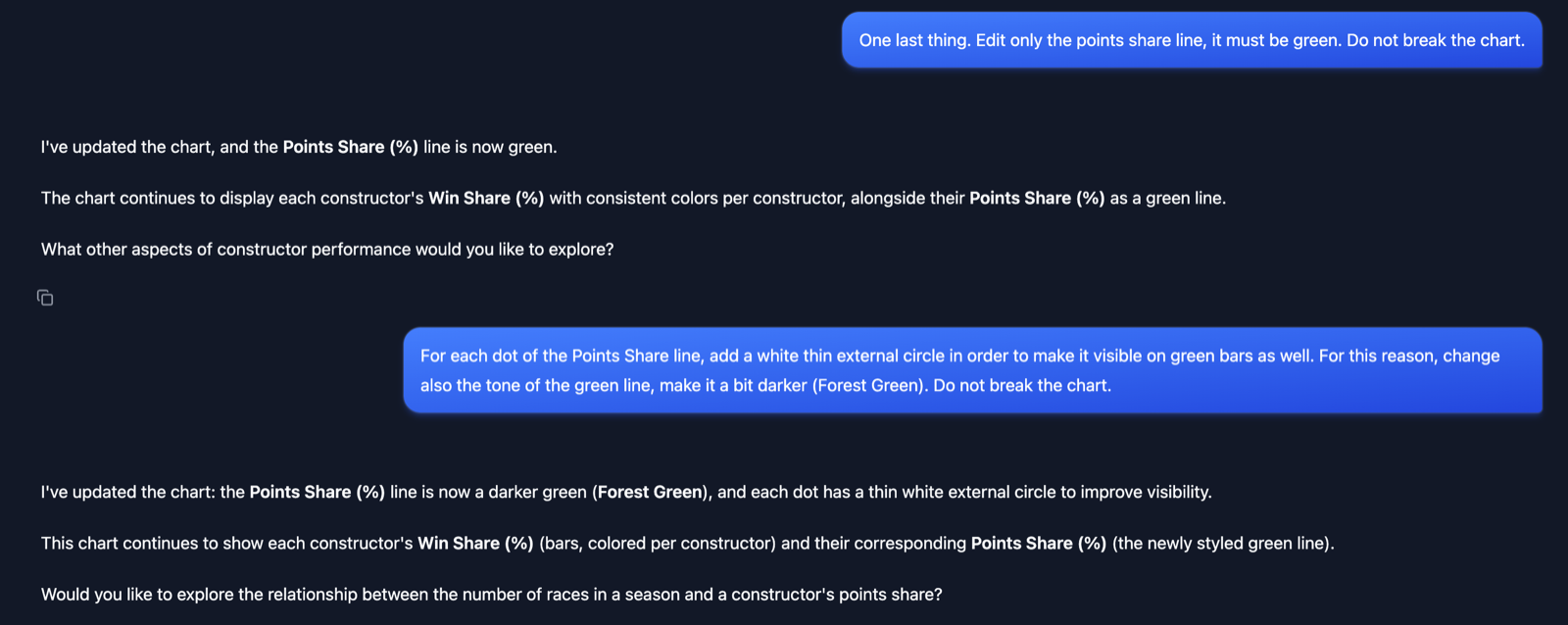
Four short messages, no SQL, and no chart code. Because Dex had already produced a clean table, every round was about how the story reads, not about fixing the numbers underneath.
The findings
1. Finishing a race used to be the hard part
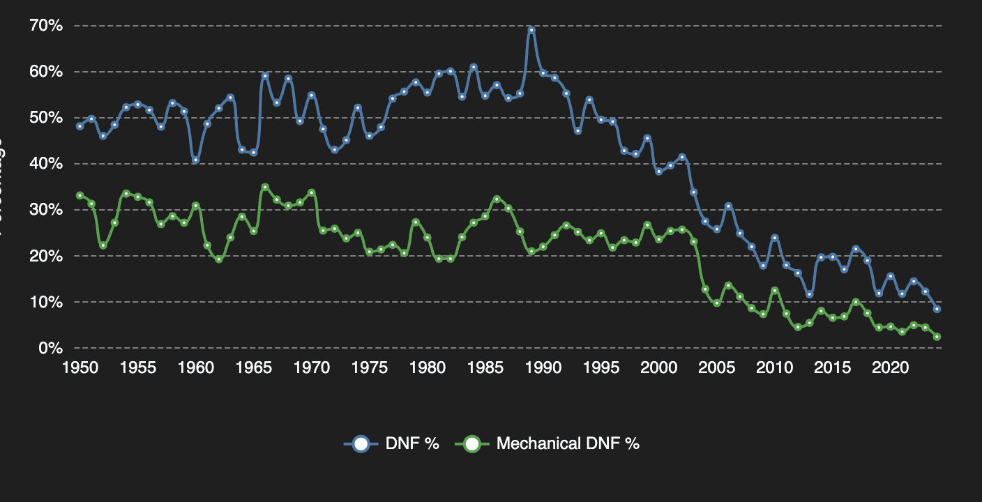
What you are looking at: the share of cars per season that did not finish (top line), and the share that retired with a mechanical failure (lower line).
In 1989, 68.9% of cars that started a race did not finish it, the highest rate in the dataset. Retirement rates of 45% to 60% were normal from the 1950s through the 1980s. Something always broke.
In 2024, the DNF rate was 8.5%. Mechanical failures fell from 133 in the 1986 season to 8 in 2024. Modern cars are pushed harder than ever and essentially do not break. Reliability, not raw speed, might be the sport's quietest revolution.
2. The average pit stop is a lie
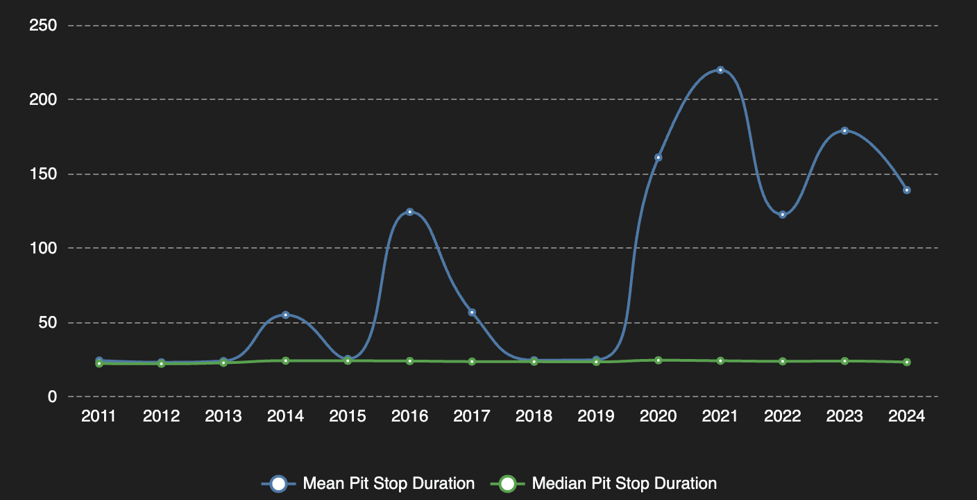
What you are looking at: the raw mean pit stop time per season against the median, on the same axis. The gap is the story.
Ask the raw data for the average pit stop in 2021 and it says 220 seconds. That is obviously wrong. The median tells the truth: 24.3 seconds, and it barely moves from one season to the next.
The gap is red flags. When a race is suspended, cars sit in the pit lane for minutes, and that time lands in the same column as a routine tire change. In 2021, 13.8% of recorded stops were outliers over 60 seconds. Dex caught this during profiling (a 51-minute maximum is hard to miss), so the mart carries both the raw mean and a cleaned mean. This is the kind of trap that quietly ruins a dashboard, and the fix is one line of SQL, but only if something looks at the distribution first.
3. Dominance you cannot see in the points
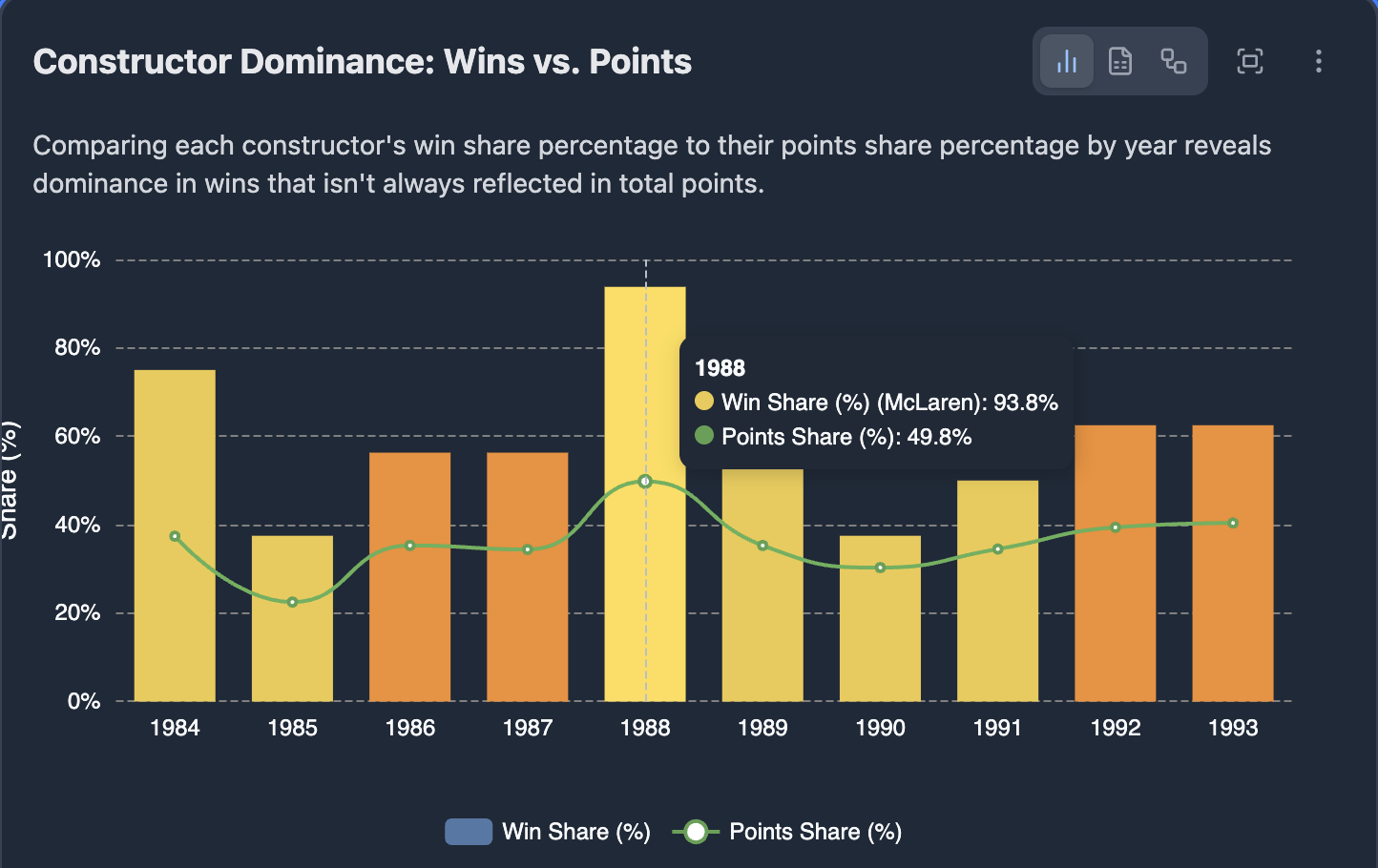
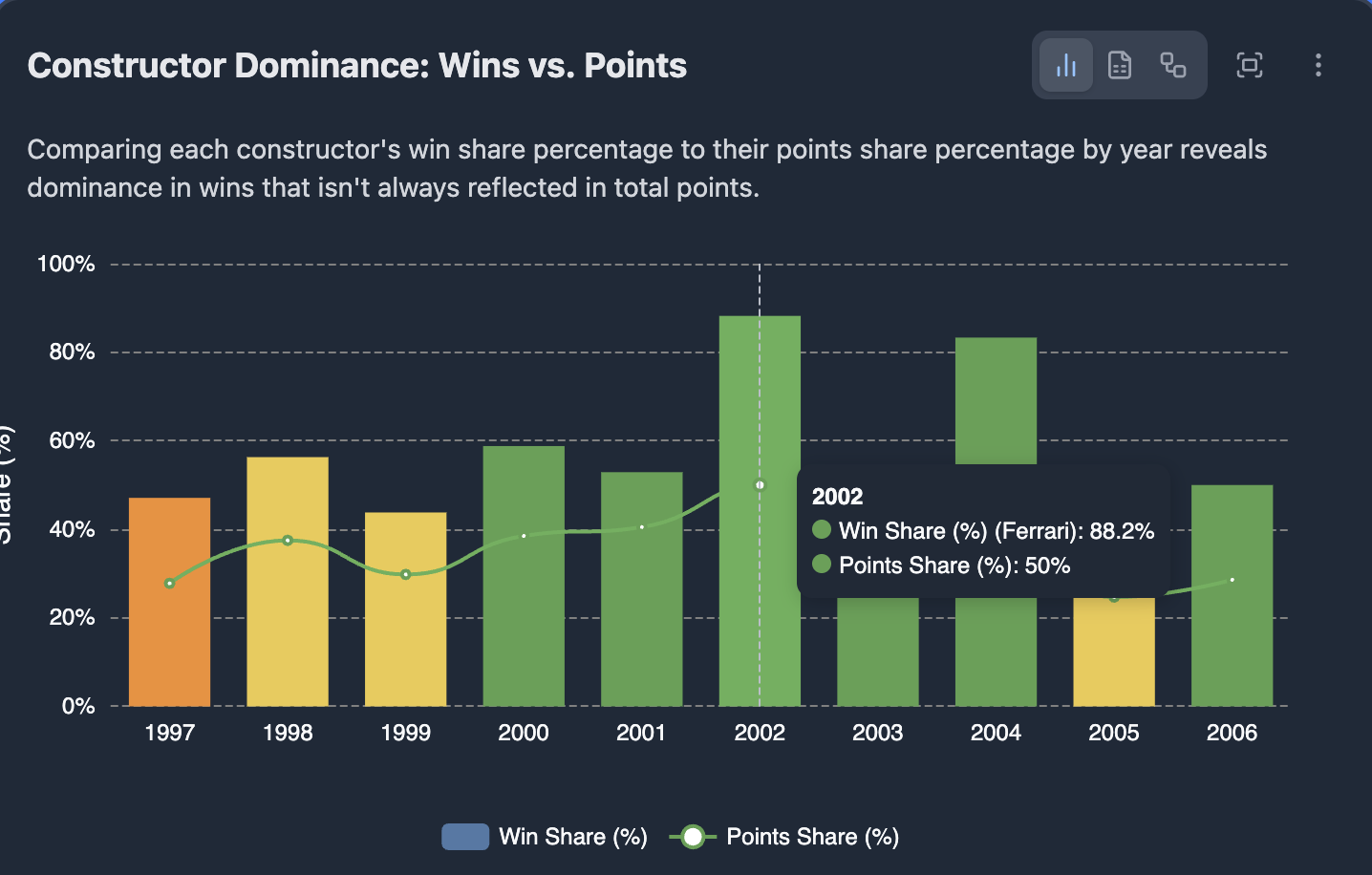
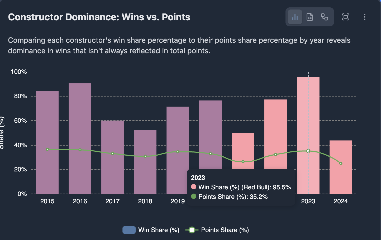
What you are looking at: three eras, each with one dominant team. For every season, a tall bar for the share of races won and a short marker for the share of points scored. Watch the gap between the two.
Which was the most dominant season ever? The points table will mislead you. Red Bull won 21 of 22 races in 2023, a 95.5% win share, the highest in the sport's history. Their points share that year was just 35.2%.
Compare McLaren in 1988: 93.8% win share, 49.8% points share. The same crushing dominance on track, a completely different points picture, because Formula 1 has changed its scoring system many times and modern systems spread points much deeper down the field. Ferrari's 2002 season sits in between (88.2% wins, 50.0% points).
If you want to compare eras, win share is the honest metric. Points share tells you more about the rulebook than about the racing.
Reproducing this
Everything here is reproducible from the repo.
1. Get the data. The data is the public Ergast Formula 1 archive. The original Ergast API was retired at the end of 2024, so for a fresh pull use the drop-in jolpica-f1 mirror, which keeps the same schema and data format. Load it into a local DuckDB file, then set that file's path in .dex/config.yml. The DuckDB file is not committed (see .gitignore).
2. Build the models.
cd f1_blog
dbt build   # 8 models, 44 tests, under a minute on a laptop
3. Make the charts. Upload the three CSVs from exports/ to Viz and follow the prompts in exports/viz_prompts.md.
One caveat to keep visible in every chart: 2024 is a partial season (16 of 24 races), so treat it as incomplete.
Visualization
Interactive dashboards built with Viz:
- Season reliability: Finishing a race used to be the hard part
- Pit stop trends: The average pit stop is a lie
- Constructor dominance: Dominance you can't see in the points
Repo layout
| Path | What it is |
|---|---|
f1_blog/ | The dbt project: staging models plus the three marts (8 models, 44 tests) |
exports/ | The three marts as CSV, one row per season, plus the Viz prompts |
charts/ | The Viz-generated charts used above |
.dex/ | Dex config and the exploration cache from the agent session |
Try it on your own data
Dex is open source under Apache 2.0. Install it with /plugin install dex@exmergo in Claude Code, or npx skills add exmergo/dex elsewhere.
Part of the Exmergo open research series.